Microinteractions: Elevating User Experience
A practical breakdown of triggers, rules, feedback, loops, and modes—and how subtle motion turns everyday interfaces into intuitive digital experiences.

What Are Microinteractions?
Microinteractions are brief exchanges between a user and a product that are usually intended to accomplish a single goal. These can be things like changing settings, turning features on or off, or getting immediate feedback after performing an action. Microinteractions, however brief, are extremely important in determining how a user perceives and uses a product in general.
Now let's talk about microinteraction components.
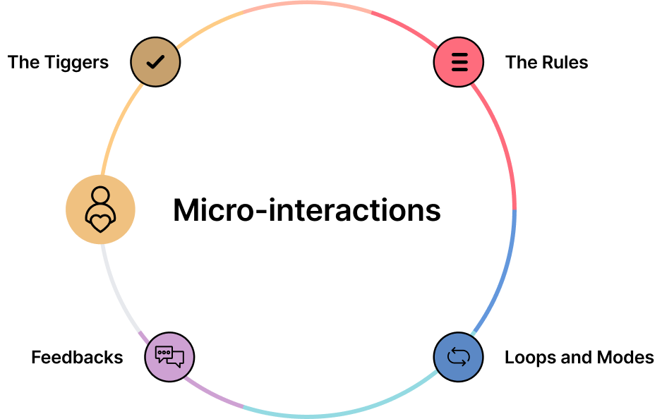
There are four major components that make up a microinteraction:
1. The Trigger
The microinteraction is started by the trigger, which can be either system- or user-driven. In addition to direct actions like clicking, swiping, scrolling, or pressing a button, user triggers can also include gestures like clapping or waving. System triggers, like getting a pop-up or message notification, happen automatically when certain criteria are satisfied.
2. The Rules
The Rules establish a coherent flow of events that conforms to user expectations following the activation of a trigger. An icon's click, for example, could start an animation, log the user out, or execute a specific task.
3. Feedback
Feedback notifies the user that the system has acknowledged their activity. This can take the form of something moving, haptic response (like vibrations), visual state changes, or audio cues. An iPhone, for instance, vibrates to show that it has switched into silent mode.
4. Loops and Modes
A microinteraction's loop determines its duration as well as whether it repeats or varies over time. For example, onboarding prompts are usually only displayed to new users because they are of no utility to experienced users. Modes alter a microinteraction's typical behavior—like adjusting a weather app's location or putting a phone on "Do Not Disturb."
Example of Effective Microinteractions
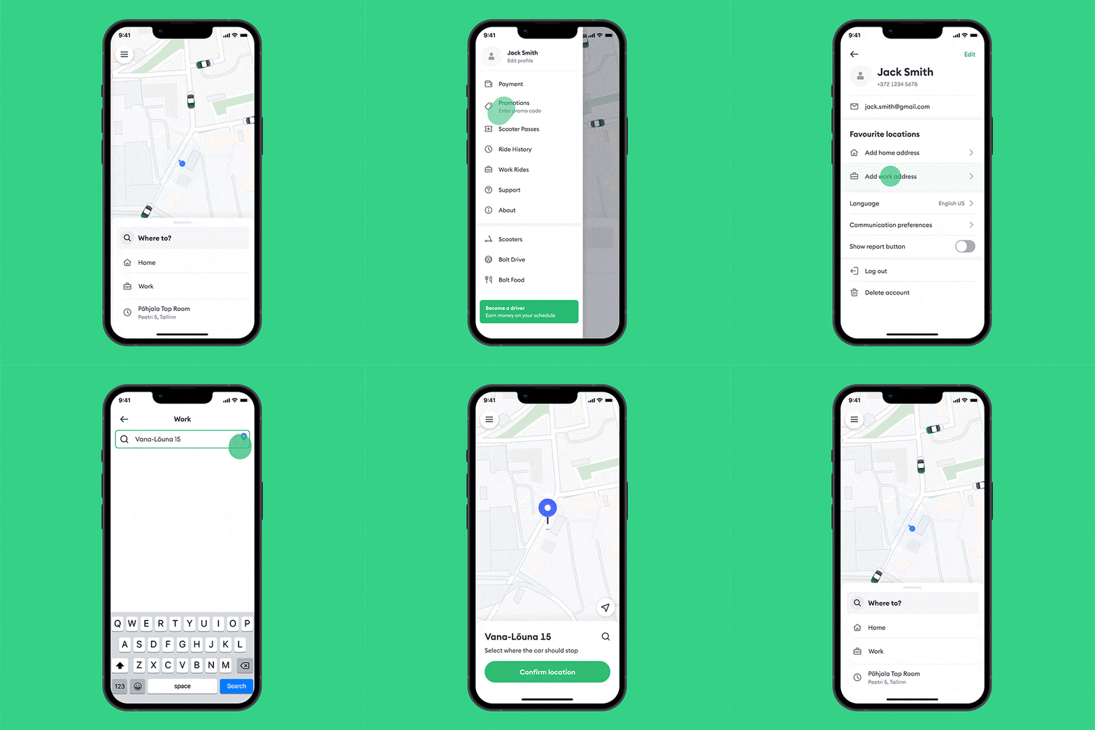
Bolt App Location Icon Animation
The Bolt app's location icon animation provides a concise example of effective microinteraction design:
- Animated feedback: When users tap the location icon, it responds with a subtle animation confirming the action.
- User guidance: Visual cues like landmarks help users pinpoint their pickup location accurately.
- Real-time updates: The app updates location details instantly as users adjust their selection.
- Smooth transitions: Seamless animations between states maintain a calm, user-friendly experience.
These elements together enhance usability and make selecting a location straightforward and intuitive in the Bolt app.
Top Techniques for Creating Microinteractions
- Identify and comprehend the user's problem: This is the first guideline for every user experience design decision, and microinteractions are no exception.
- Maintain natural microinteractions: Avoid odd animations that take too long to load or divert the user's attention. The goal is to craft microinteractions that feel intuitive and natural between the user and the product—blending seamlessly into the interface.
- Test and iterate with real user feedback: Give usability testing top priority and feed what you observe directly into refining timing, clarity, and responsiveness.
- Adhere to the four microinteraction components: Design every detail intentionally around the Trigger, Rules, Feedback, and Loops & Modes.
What Is Not a Microinteraction?
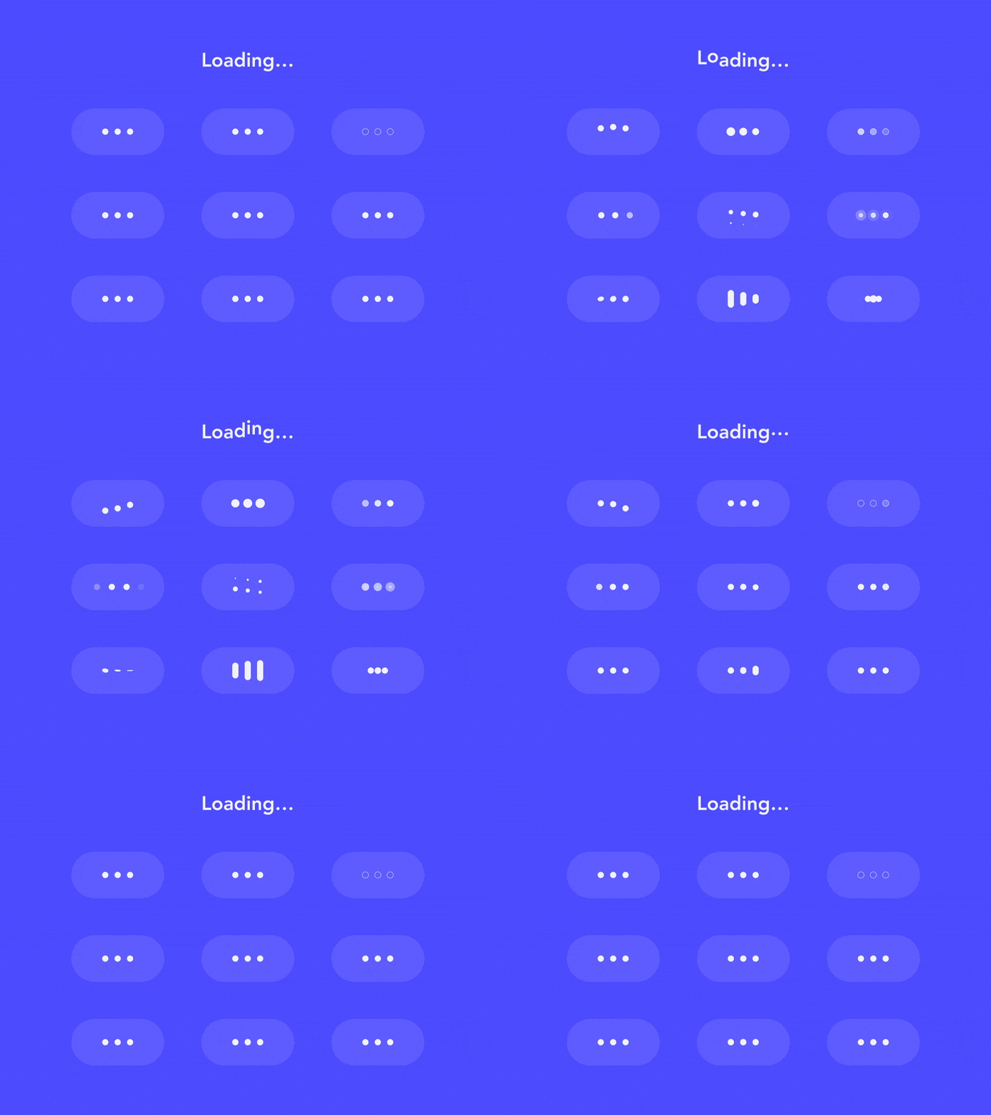

Loading Animations
Consider Slack's witty and varied loading messages. They turn a mundane wait time into a more enjoyable moment, reducing perceived waiting time while reassuring users that the workspace is actively loading.
Bolt App Car Animation
The Bolt app's moving car animation is another prime example of a microinteraction that elevates user experience. Showing a small car icon moving smoothly along the map to indicate the driver's current position accomplishes three critical UX jobs at once:
- Provides real-time reassurance that the app is actively tracking your ride.
- Clearly communicates how close or far the driver is from your pickup point.
- Engages users with a visually clean and genuinely functional detail.
Ifeanyi Ananti
Ifeanyi Ananti is a Creative Art Director, AI Product Designer, AI Prototyping Specialist, and UI/UX Designer turning complex ideas into high-performing digital products, scalable design systems, and interactive AI experiences.